Templates
Page anatomy and the layouts tools are built from.
Tool Templates
Working reference implementations every new tool copies. Each is a real, fully client-side tool — pick the template whose shape matches your tool's input and output, then swap in your logic.
Suitable for: text-in, text-out transforms — encoders, hashers, case converters, slugifiers
Structure: header → input textarea → controls → output panel → inline error
Base64 Converter
Encode text to Base64 or decode it back. Unicode-safe — emoji and accented characters round-trip correctly.
Runs locally — nothing leaves your browser.
Suitable for: code or markup in, live processed output — formatters, minifiers, transpilers, converters
Structure: header → toolbar → resizable input | output → status bar → validation
JSON Formatter
Pretty-print or minify JSON with your choice of indentation. Parsing and validation happen live as you edit.
Runs locally — nothing leaves your browser.
Suitable for: numeric inputs with a primary computed result — ratios, unit conversions, rem/px, color maths
Structure: header → inputs pane | results pane → formula → actions
Aspect Ratio Calculator
Enter a width and height to get the simplified ratio, decimal value, and megapixels. Lock the ratio to scale height with width.
Runs locally — nothing leaves your browser.
- Decimal
- 1.7778
- Megapixels
- 2.07
- Orientation
- Landscape
gcd(1920, 1080) = 120 → 1920÷120 : 1080÷120 = 16:9Picking a template: A for text-in / text-out transforms, B for code or markup with live processed output, and E for numeric inputs that produce one primary result. Templates C, D, F, G, and H (wizard, dashboard, gallery, and others) will be added here when their first tool is built.
Tool Page Anatomy
Every tool page shares one chrome. ToolPageHeader renders the registry icon, the page's single h1, and the version badge; WipToolGate decides whether the real tool body renders. Tool components own neither their h1 nor their gating.
Header & version badge
The version comes from the newest changelog entry whose frontmatter lists the tool (version, defaulting to 1.0), and the badge links to that entry. No changelog entry, no badge.
Demo Tool
v1.1The tool's intro paragraph sits tight beneath the title — the header offsets the page gap so the pair reads as one block.
A markup replica with demo data — the real ToolPageHeader reads the tool registry and changelog at build time, and its title is the page's only h1 (rendered as a p here to keep this page's heading tree honest).
WIP gate
While a tool is WIP and WIP content is hidden — production, unless NEXT_PUBLIC_SHOW_WIP=true — WipToolGate swaps the tool body for the workbench placeholder. The page header and breadcrumb stay.
No-data state
A tool that needs a loaded document (file, paste, or sample) shows the same Empty composition before anything is loaded: an icon-variant EmptyMedia, a short title, and a description that names every way in. The way in is always the outline SampleButton (file-stack, label Sample), sized to match the row — never a bespoke Load example variant.
Live examples: Font File Explorer, Glyph Browser, Hex Editor, CSV Explorer. The Sample button convention lives in the worked template under Templates.
Changelog entries live in content/changelog/YYYY-MM-DD-slug.md with frontmatter title, date, version, tags, and tools; entries for WIP tools are hidden by the same environment rule, and the RSS feed is generated from the same files. Shipping a tool update means shipping its changelog entry — that is what moves the version badge.
Open Graph
Social cards are generated at build time (Satori + resvg) into static 1200x630 PNGs. Each layout below is the file crawlers receive — one example per layout, not every tool.
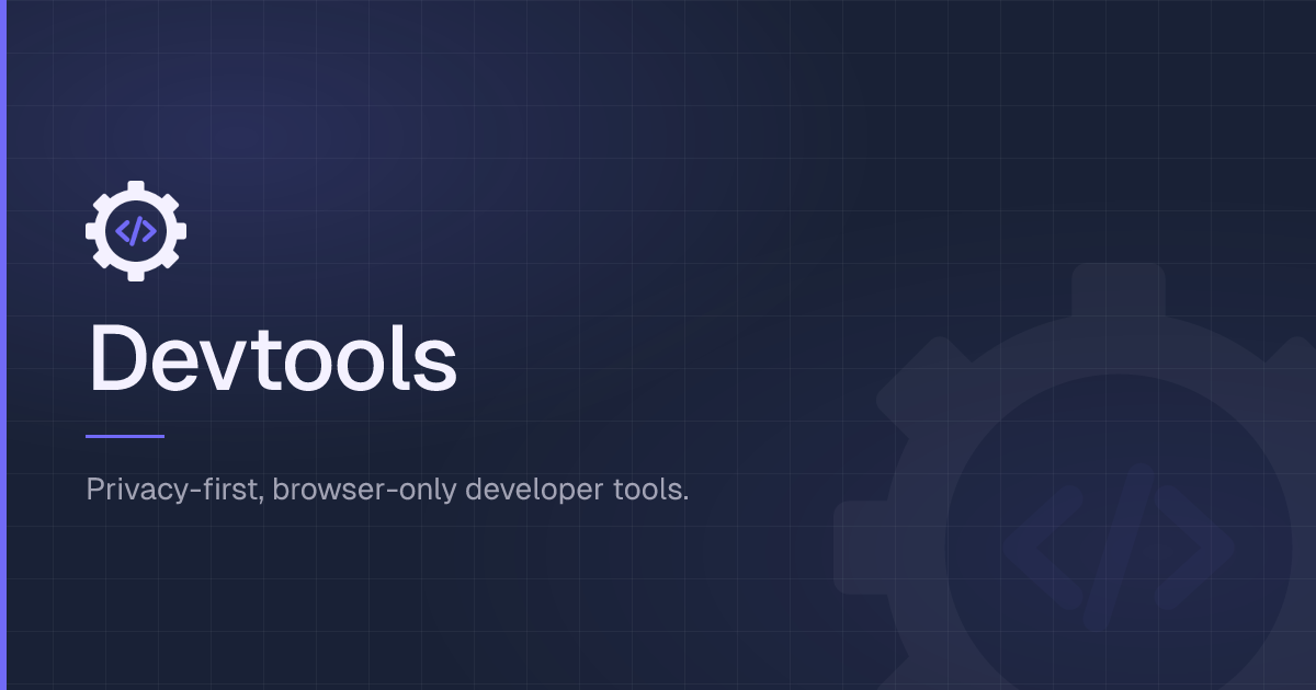
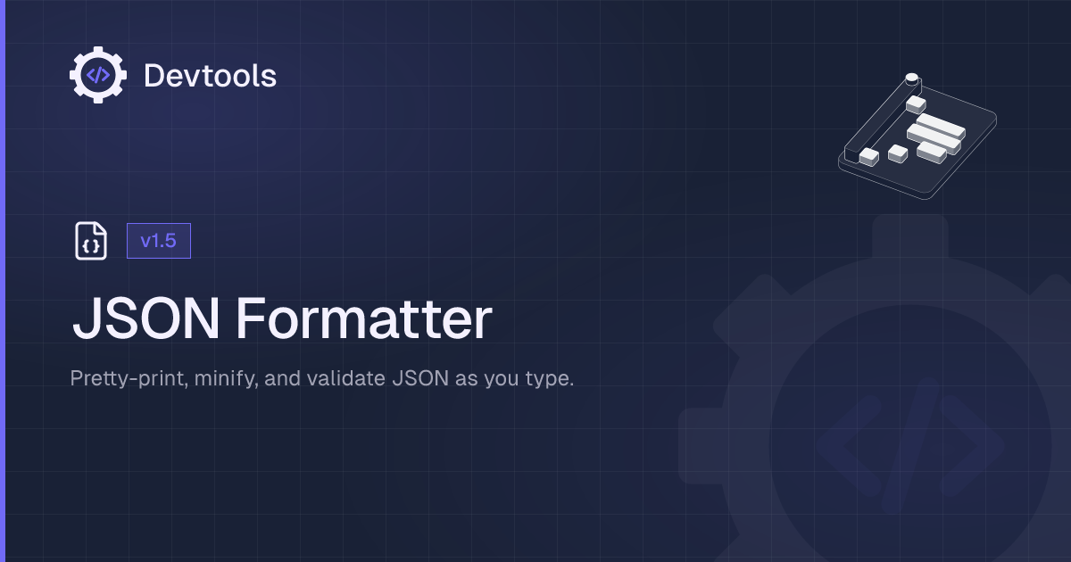
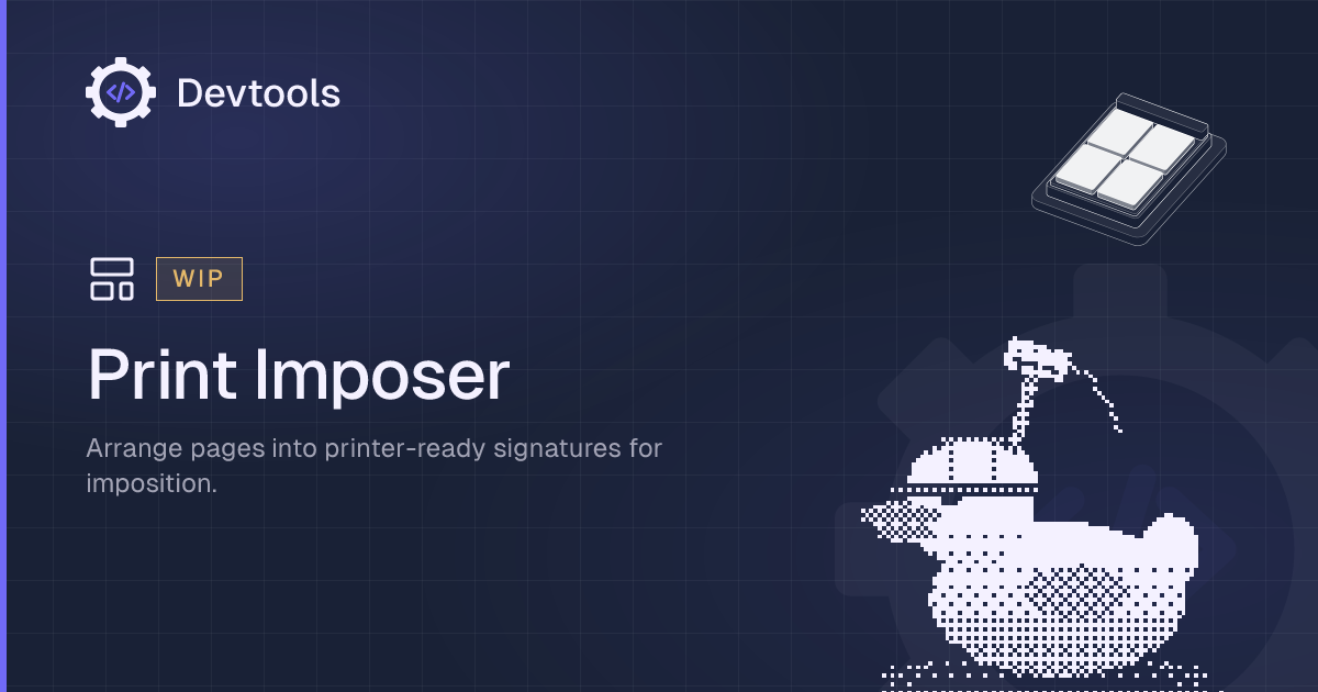
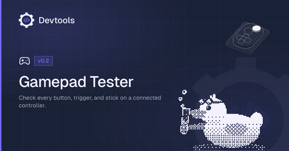
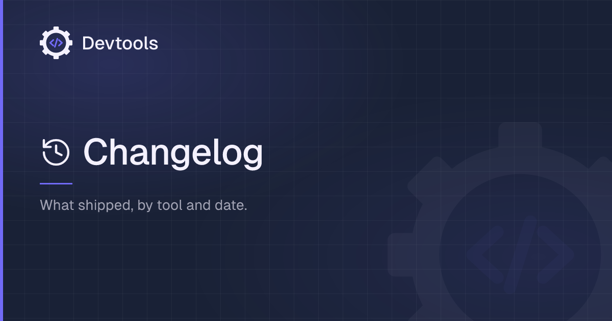
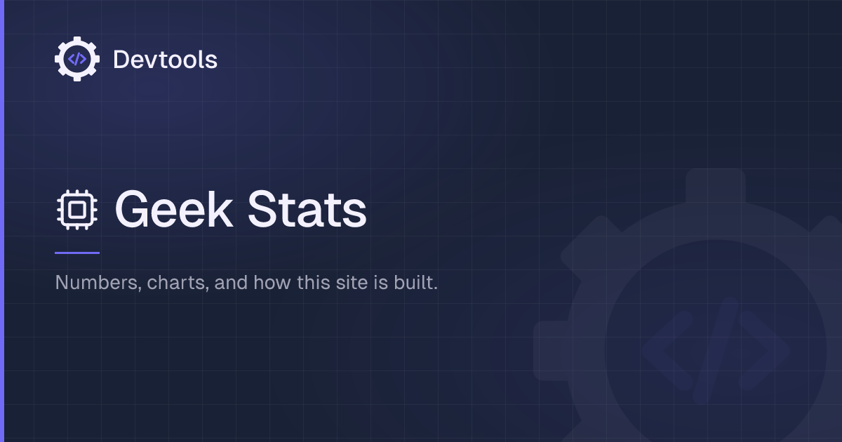
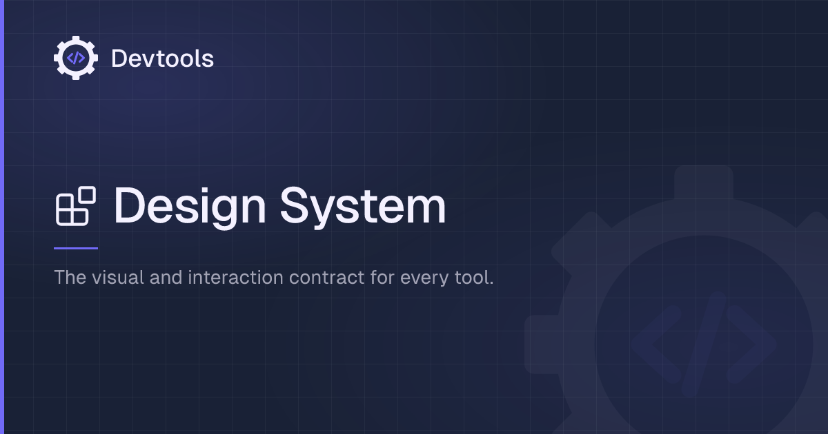
Layouts live in src/components/og/ and are the same trees the generator renders. Previews here are the generated PNGs so this tab matches what Slack, iMessage, and Mastodon unfurl.